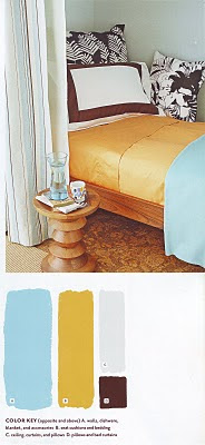
The language of color uses hot, cold, warm, cool, or neutral words to describe how your body senses or visually “feels” temperature in a room. While these color words don’t describe actual degrees of physical heat, they do try to explain color’s effect on your physical well-being, activity level, and mood.
Some like it hot - rooms filled with bold, intense colors. Others prefer icy, reserved spaces of white, black, and gray. Most people like their rooms somewhere in between - warm, cool, or neutral.
WARM COLORS heat things up. They move forward in a room, communicate vigor, spread cheer, energize, stimulate appetites, promote excitement, and beg for attention. Yellow, orange, and red are the usual suspects, but sometimes purple, green, and blue come in warm, flirty tones if mixed with yellow or red.
COOL COLORS, as the word implies, seem to lower a room’s temperature. They step away, receding into the background. They’re known for their passive natures and are useful for cooling you down, calming nerves, lifting spirits, and promoting contemplation. Most people find them soothing. Blue, green, and purple are usually labeled as cool, but red, yellow, and orange can also come in laid-back, calming tones if mixed with blue.
NEUTRAL COLORS (brown, gray, white, and black) create a room temperature somewhere in between warm and cool, depending on which hue you choose. Browns, such as taupe, cappuccino, khaki, or beige, symbolize a down-to-earth attitude and make you feel safe and secure. Grays, such as ash, granite, silver fox, or dove, work with all other colors to create spaces that are easy on the eyes. White can be as warm as cream or cold as snow, depending on whether it’s mixed with red, blue, or yellow. And black? Black is basic, strong, the opposite of white. Mixed with white it becomes gray – a less powerful force in a room.
No doubt you've heard the phrases "tickled pink," "green with envy," or "seeing red." Clichés common to Western culture, they reflect the sentiments attached to certain colors. Although a few hues have been shown to affect the heart rate, most color associations are culturally conditioned:
Gray, the color of quiet reserve, retreat, inactivity, and cool distance, takes a room away from the busy hubbub of a wild and colorful world. Associated with precious metals and weathered seashores, it’s a classy and sophisticated way to neutralize a room. It associates well with any other color, so its uses are countless.
Yellow, the color of intellect and thought, promotes sunny feelings and a sense of well-being. Strong versions are said to stimulate the brain, aid clear thinking, and promote communication. Softer forms of the color are as warm and embracing as sunshine. The shades of this color make good choices for north-facing rooms.
Purple, the up-for-anything color of dream and spirit, brings a sense of inner calm and inspiration to a room. In pale versions it makes a room appear larger, promoting contemplation or lighthearted fun. In pure, saturated forms it’s royal, slightly off-the-wall, yet sophisticated.
Green, the color of health and vigorous growth, evokes feelings of renewal and hope. Research shows that when people look at this color heart rates slow and people visibly relax. A walk in the woods helps connect with its restorative, healing qualities.
Black, the color of strength, night, and magic can strike fear into color schemers. Interior designers know its power to create drama, formality, sophistication, and contrast. For maximum emphasis use it to draw attention to furnishings, tie everything together, and underscore your color confidence.
Red, the pick-me-up color of heart, passion, and action, fills a room with emotional energy. Color therapists say it stimulates appetite and conversation, so it’s often used in food advertising. In bold and gregarious tones, it seems to draw the walls of a room close, creating a cozy mood. Pastel versions set a more relaxing, nurturing, romantic tone.
Brown, the mellow color of natural wood and earth, successfully bridges decorating gaps wherever needed. Associated with safety, security, and comfort, its warm neutrality surrounds a room like a hug that’s not too passionate. Pale versions are expansive and reasonable; darker ones are dramatic and graphic. This color’s laid-back tones work well at home in broken patterns and natural textures, just as they appear in nature.
Blue, the color of calm, is the most popular color in American homes. It aids relaxation, honest communication, and sleep. Connected to sea and sky, it’s associated with clear thinking and meditative environments. It’s like a breath of fresh air, serene and restful. In dark versions it symbolizes strength, loyalty, and dependability.
White, the color of cleanliness, innocence, and purity, can look clinical if not balanced with textures or other colors. Yet it refreshes, clarifies, and unclutters a room. It’s associated with calm silence, like a landscape expanded after snowfall.
Orange, the color of enthusiasm and sociability, elevates sensuality and strong feelings. It stimulates creativity, wraps a room with warmth and energy, and inspires optimism and self-confidence. The “it” color for the mid-2000s, it overcame its unflattering image from the late 1960s and 1970s.
Pages 8, 10, 11 and 99 from Color Schemes Made Easy by Better Homes and Gardens


1 comment:
High-quality kitchen cabinets Vancouver
Post a Comment