The Inspiration
I saw this at IKEA and immediately liked it.
The Space
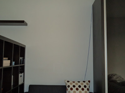
This wall needed something, but I wasn't sure what. At first, I thought maybe a print from Diana Francis, but it's a little out of our budget and not to mention bulky (the problem of how to bring it home). Then I saw the wall arrangement at IKEA and knew that was the answer.
The Plan
I hit a roadblock when I realized that most of our photos are horizontal and not vertical. Thus, the need to redo the layout.
The Result


No comments:
Post a Comment